
XGBoost is All You Need - Part 7
Nontrivial use case 3: use of XGBoost for unsupervised tasks

This is the seventh, and last, installment in my series of posts on XGBoost, and the third on practical applications, based on my 2024 GTC presentation. Previous posts can be found at the following links: Part 1, Part 2, Part 3, Part 4, Part 5, Part 6.
Challenges in Visualizing Tabular Data
Tabular datasets are notoriously difficult to visualize and interpret compared to image or text data. Unlike an image (which a human can “see” patterns in) or a piece of text (which we can read and comprehend), a table of raw features doesn’t present an obvious structure to our senses. It’s often up to the analyst to dig through the numbers, plotting one or two features at a time to detect patterns. Even then, high-dimensional relationships can be elusive; you might create scatter plots or apply dimensionality reduction techniques, but capturing all interactions is tough. In short, tables may contain precise values, but they “do not tell a story” on their own – the reader must interpret the numerical data, find patterns, and draw conclusions. This lack of an immediate visual narrative makes understanding complex feature relationships in tabular data challenging and motivates the search for better representations.
Using Shapley Values from a Supervised Model for Unsupervised Clustering
One way to tackle these interpretation challenges is to transform the tabular data into a more meaningful representation before trying to visualize or cluster it. Here’s where Shapley values come in. Shapley values are typically used in supervised machine learning to explain model predictions – they quantify how much each feature contributes to a particular prediction. The interesting twist is using these values outside their usual role: leveraging them for unsupervised tasks like clustering. The idea is straightforward: train a supervised model on your tabular data (using a relevant target variable), and then use the model to compute Shapley values for each instance. This converts your raw dataset into a new dataset of the same shape where each feature’s raw value is replaced by its contribution to the model’s output. In essence, we are using a supervised learning step to inform an unsupervised analysis. Of course, this approach assumes you have a target variable to train the model in the first place – a notable departure from traditional clustering which is fully unsupervised. Fortunately, in many real-world scenarios an outcome of interest exists (e.g. a known class label or result we care about), making it feasible to apply this strategy. By converting raw features into Shapley values, we inject domain-relevant signal (learned by the supervised model) into the data before performing clustering.
Why Use Shapley Values for Clustering?
Using Shapley values as a preprocessing step for clustering offers several important advantages over clustering on raw features. Fundamentally, Shapley values act as a feature transformation that preserves relationships relevant to a prediction target. This means the structure in the data that influenced the model is retained, while arbitrary scale differences and noise can be reduced. In practice, clustering on Shapley-transformed data tends to yield groups that align with meaningful patterns (since points in the same cluster have similar feature contributions towards the outcome), rather than groups driven by just raw value similarity
Shapley values are expressed in the units of the model’s output (e.g. contribution to a prediction probability or log-odds). All features’ contributions are on a comparable scale by construction. This greatly reduces the risk of distance-based clustering algorithms being skewed by features simply because they have larger numerical ranges or different units (a common issue when, say, mixing revenue in dollars with age in years). In other words, the data is effectively self-normalized by the model’s predictions, so no manual feature scaling is required.
The Shapley value representation has essentially the same number of features as the original dataset. Each original feature yields one Shapley value (per instance) representing its contribution. This means we are not creating an expanded feature space; instead, we’re replacing or augmenting the original features with their model-derived counterparts. You can plug these values into a clustering algorithm as a drop-in replacement for the original features without worrying about additional dimensions complicating the clustering process.
If your dataset has categorical features, the supervised model will handle them during training (for example, through label encoding). The resulting Shapley values for those features are numeric importance scores. Thus, there’s no need for separate encoding of categorical variables purely for the sake of clustering – the model + Shapley pipeline has already taken care of translating category levels into a consistent numerical contribution. This simplifies preprocessing, sparing us from choosing between one-hot, label encoding, or other schemes for mixed data.
When using tree-based models (like XGBoost or LightGBM) to generate Shapley values, missing values in the data can be handled natively by the model. For example, XGBoost will send an observation down a default branch if a feature value is missing, meaning the model can still make a prediction without explicit imputation. The Shapley values computed from such a model inherently account for missingness as part of the feature’s contribution (or lack thereof). This eliminates the need to worry about imputation or special treatment of NaNs before clustering – the model’s logic has absorbed that complexity.
Because Shapley values put features on an equal footing (in terms of scale) and weight them by relevance, the clusters obtained from this transformed data tend to be more well-separated and meaningful. We are effectively clustering based on how observations behave relative to a target outcome, rather than on raw feature magnitudes. Using Shapley values for clustering can produce clearer groupings, where each cluster is defined by a distinct pattern of feature contributions rather than arbitrary numeric similarities.
Interpreting Clusters with an Auxiliary XGBoost Model
After clustering the data in this Shapley value space, the final step is understanding what defines each cluster in terms of the original features. We have clusters that were formed using the supervised model’s insights – now we want to translate those clusters back to domain language (original features and their values). A convenient way to do this is to build a second, interpretable model that predicts the cluster assignments. In practice, one can take the cluster labels as a new target variable and train a classifier (for example, an XGBoost model) to predict which cluster an instance belongs to. Essentially, we treat the task “is this data point in Cluster A, B, C, etc.?” as a multi-class classification problem. By training an auxiliary XGBoost model on the original dataset with cluster IDs as labels, we obtain a model that encapsulates the differences between clusters. We can then apply Shapley value analysis (or examine feature importances) on this model to see which features most strongly drive the distinctions between clusters. This approach gives us human-interpretable explanations for each cluster: for instance, we might discover that Cluster 1 is characterized by high values of Feature X and low values of Feature Y contributing to the outcome, whereas Cluster 2 has the opposite pattern. In summary, this step closes the loop by using explainable AI tools on the clustering results themselves. The next section of this post will dive into this interpretability step, building the auxiliary XGBoost model and using it to explain what makes each cluster unique, so that we not only have robust clusters but also a clear understanding of their defining features.
The entire procedure for using XGBoost for a simple visualization and clustering procedure looks like this:
•For a supervised learning task – create a simple XGBoost model (don’t worry about predictive performance)
•Get Shapley values for all datapoints
•Use a simple dimensionality reduction scheme (t-SNE, UMAP) for visualization of features
•Use a clustering algorithm to extract clusters
•Other dimensionality reduction schemes: neural nets and autoencoders
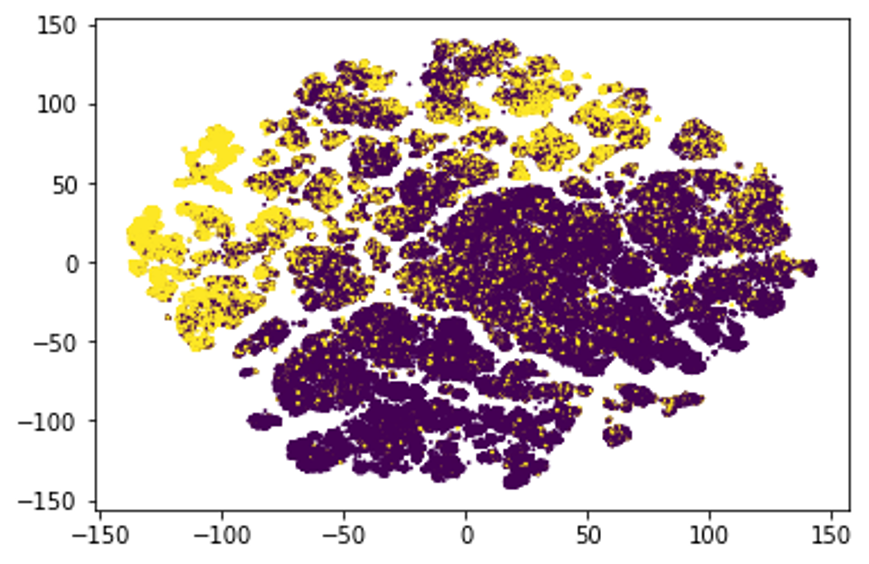
For illustration, here is an example of what the Porto Seguro dataset (that we’ve been using in the previous couple of examples) looks like once we’ve applied the above procedure and reduced it to a two-dimensional space. Various clusters are clearly visible, and the distinction between the positive and the negative class is also clearly visible. Now, all of this is to some extent to be expected - after all, the visualization is based on features that have already been created to perform well with a predictive model. Nonetheless, many important insights can still be gleaned.
Why XGBoost and not simpler statistical methods?
In principle, all of the above could be done with lots of careful statistical analysis. For example, after forming clusters, an analyst might examine which features differ the most across those groups using statistical measures or tests. Techniques exist to score features by how strongly they relate to cluster labels – for instance, measuring the variance or correlation of each feature with the cluster assignments. In practice, this could involve applying methods like analysis of variance or chi-square tests to each feature to determine its significance in distinguishing clusters. The traditional route of interpreting clusters through manual statistical analysis often demands substantial time and specialized expertise. Designing the appropriate models or tests for each aspect of the data isn’t straightforward – it requires a strong background in statistics to choose suitable methods and a deep understanding of the subject matter to make sense of the results. Analysts might need to try multiple modeling approaches, account for interactions or non-linear effects by crafting new variables, and validate that each model is sound. All of this can be time-consuming and complex. Using XGBoost and Shapley values offers a more straightforward path to visualize the datasets, find clusters, and interpret clustering outcomes, leveraging computation to reduce manual effort. In practical terms, a data scientist can achieve in a short time what would otherwise require exhaustive statistical exploration – setting up a robust visualization, find clusters in the dataset, quickly identifying the key features that drive cluster formation and how they combine, without having to explicitly program each hypothesis. This scalable, off-the-shelf procedure allows one to make visualization and interpret clusters with far less effort, making advanced insight accessible even when time or deep statistical expertise is limited.
Beyond supervised tasks
The above procedure worked pretty well as long as we were dealing with straightforward supervised problem upon which we could build our analysis. However, most visualization, clustering and similar problems deal with pure unsupervised problems. The question then becomes how to apply this procedure to those situations. For instance, would it be possible to create an XGBoost based autoencoder? And if so, would dataset embeddings with XGBoost be something that can be achieved? These are some very intriguing questions, and potential topics for further research.
hi Bojan you article is very good, but i have not read anywhere before about the section "Interpreting Clusters with an Auxiliary XGBoost Model" is there some more reference i can use to read about this technique for validation and inference